Study Study Study

So recently I’ve been doing alot of studying with Bargue drawings, anatomy studies, still lifes and master studies.  There is more in my sketchbook but these are my favorites so far.oct-21leyendecker-footballMaster study of Leyendecker’s football player painting, WIP.  I’m really struggling with this one mostly focusing on the face right now. But slowly getting it.  Just gotta keep working on it.


Below are several Bargue drawings:20161026_12561820161026_12562820161026_125648

Below here, are several anatomy studies from Hogarth:20161026_12570820161026_12571920161026_12572920161026_125740

I’ve also been working on a commission but don’t have the permission yet to release the works.

Study Study Study

Been a while… Studies, a sketch and a WIP

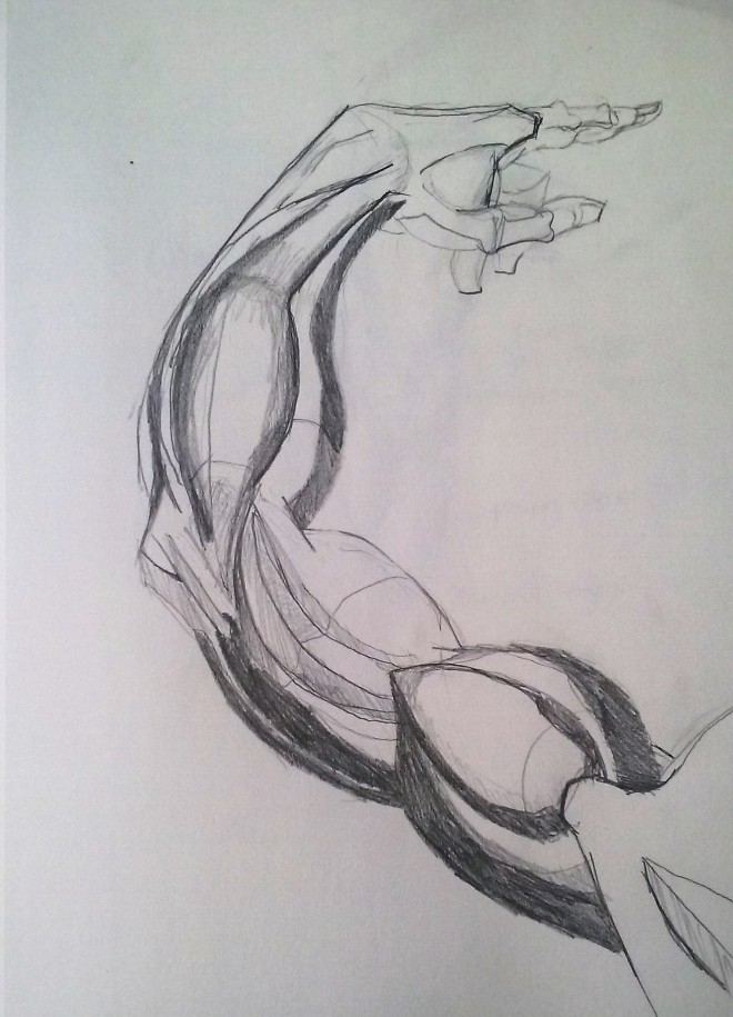
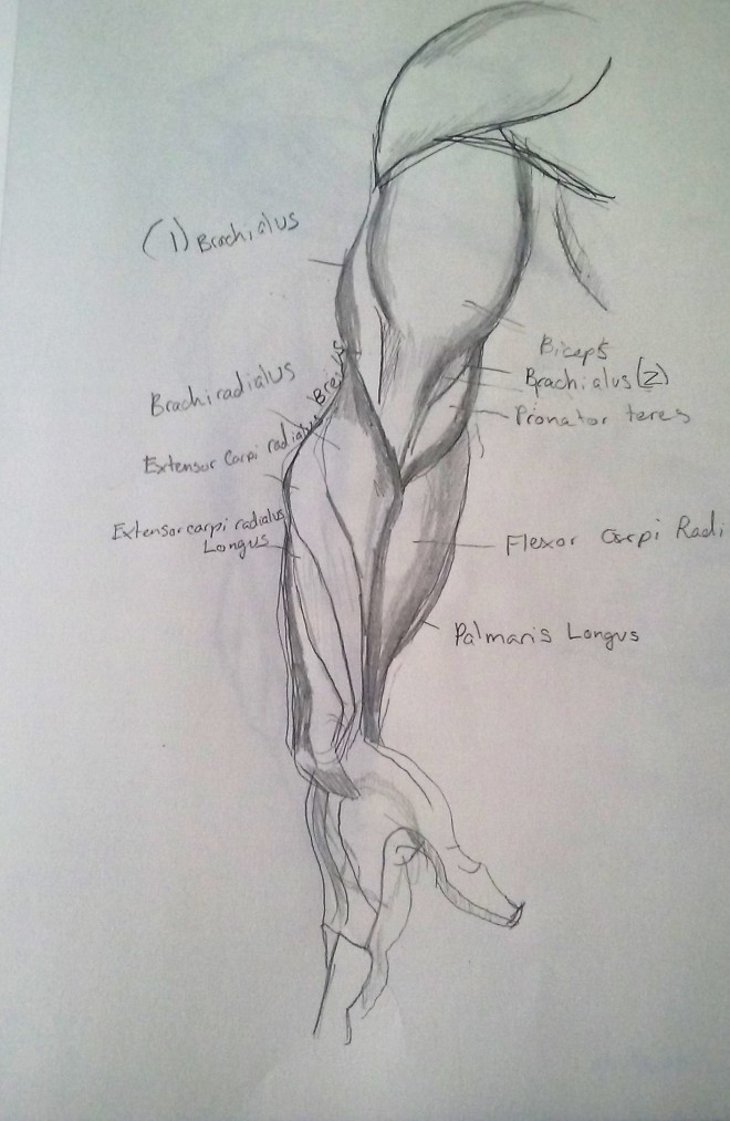
I’ve got a lot more studies in my sketchbooks, but I can’t take a picture just yet the sun’s gone down but I hope this will suffice lots of stuff added here anyway I think.still-life2-september-7-2016

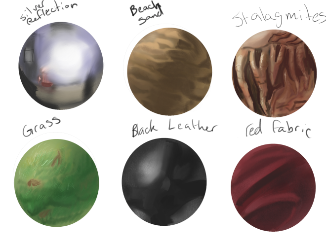
I was told by a cool artist on DA [here] that I should focus on something simple with my studies and I choose to see how hue changes with a colored transparency, like canada Dry bottles and also reflection of color on a black shiny surface.  It looks like crap but I learned that mixing the complementary colors of the red and green with transparency it seems just to darken the color behind it there was more red showing behind than I though, it just seemed to darken it.  Half way through my cat decided to stick her butt in the way so added her it in frustration.

self-portrait-2This is a self portrait I did under sunlight instead of a lamp and found that there’s very little value difference throughout the face than with other lighting but there was a bit of hue variation throughout the face.  Didn’t have much time to do that one unfortunaty so weird lines and brush strokes.20160911_120347Value self portrait with lamp and graphite.  Had wet hair so it clumped more than usual.

20160911_120155Value self portrait study in direct sunlight and a mirror again and woodless graphite.20160911_120233

Studying Loomis’s book 20160911_120331
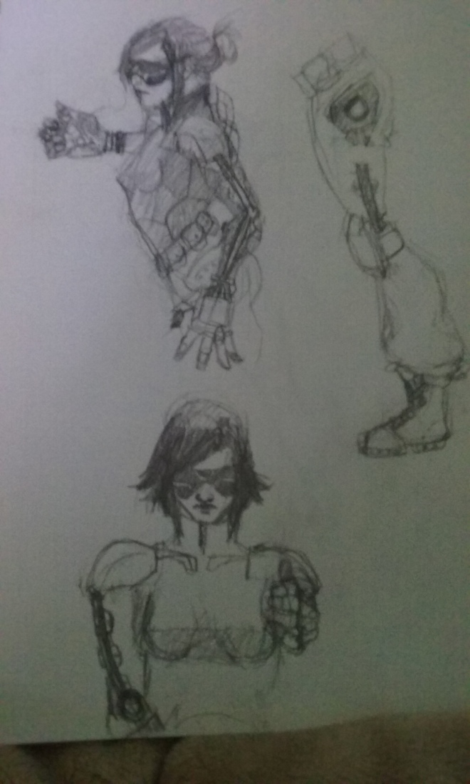
A sketch of  a character from my comic that I liked.me-jedi-bwA self portrait/reference piece I’m working on, with Star Wars.  Reference [here]

Been a while… Studies, a sketch and a WIP

Some Studies

So I had a chat on deviantart with a really cool artist who said I might benefit from studies like these so I’ve decided to give it a more thorough try.  So hear we go.still-llife-august-30-2016
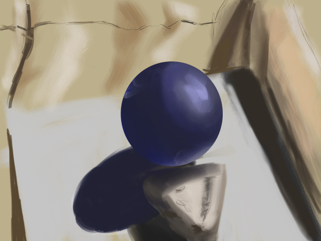
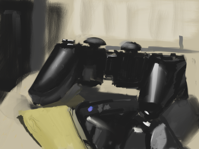
I did this in 2 hours.  I think I got the cell phone on the wrong perspective, something I definitely need to try again.  I need to work on reflections in a black shiny surface.  But it was a shot.

self-portrait-1

Here’s a self portrait I did in the mirror.  This one I had a real difficult time with, getting the skin to look…. well, like skin.  And always bad at hair.  I worked for 3 hours on this one and then got hungry and had to leave and the lighting situation changed again so I stopped.  Not sure if it’s my best portrait but it’s something. I’ll be trying more in the mirror and maybe from some photos (not of me).


Some Studies

Back in WIPs (and some sketches)

sketches 3
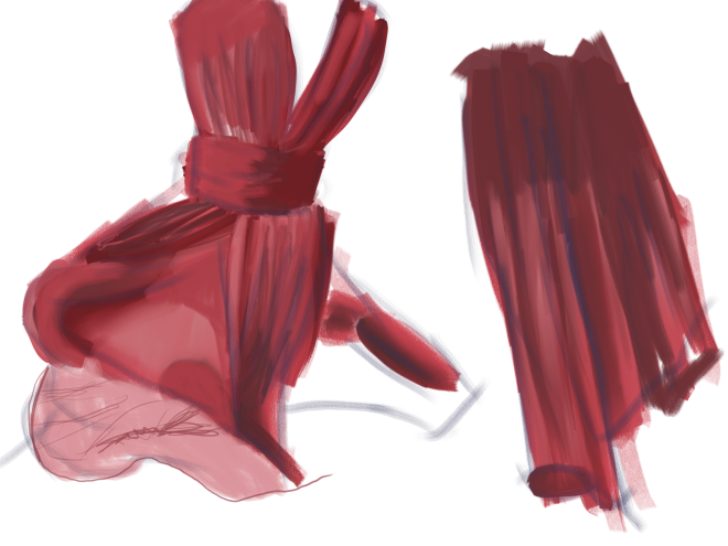
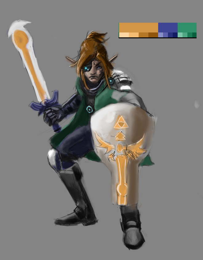
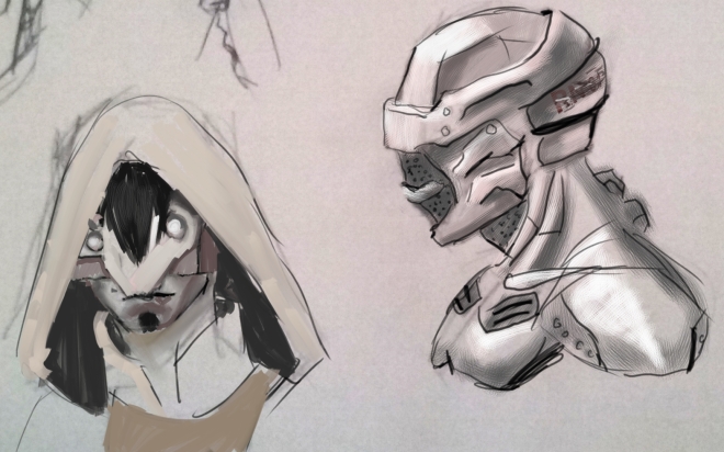
Here’s some sketches from my sketchbook of character design that I painted over.  Thought I’d  just show them cause well I kinda like em (for once). Now for the WIPs…eve walkkng 3
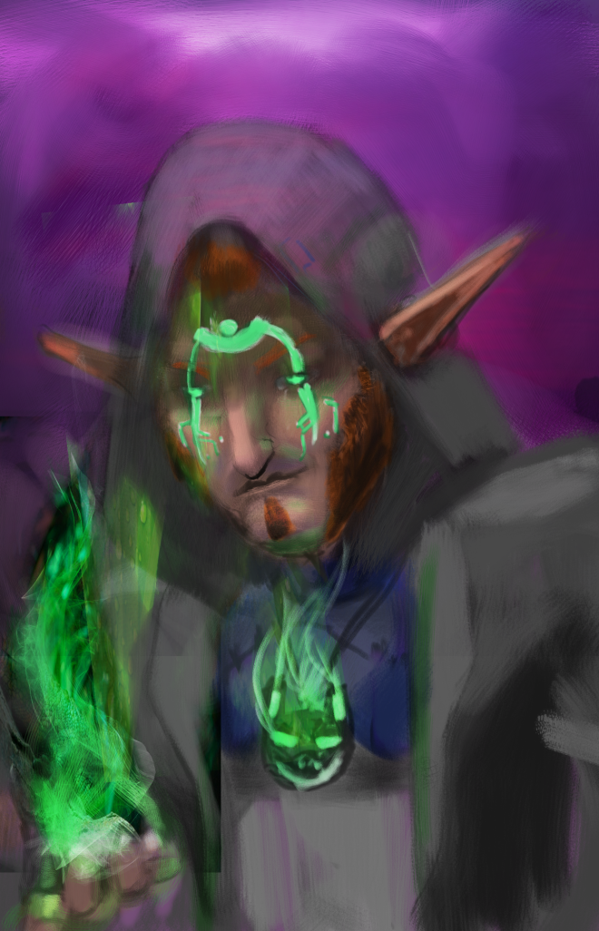
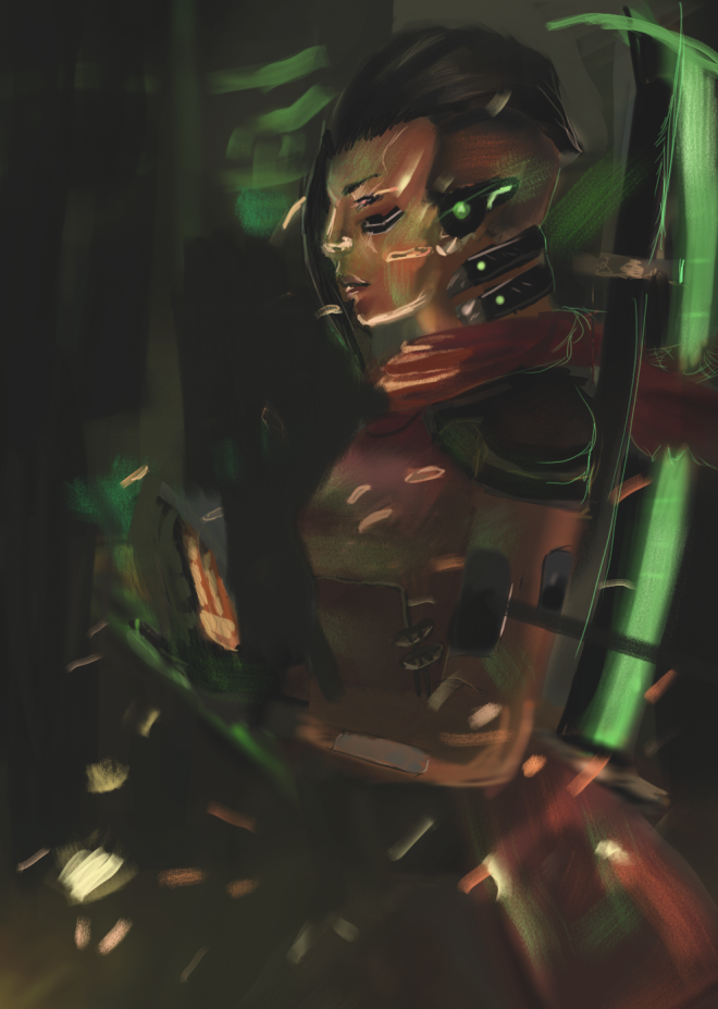
So here’s one where I play with embers that I’m still working on!  Redid the composition a bit.  Hopefully it’s a little better.basic hall way nikki
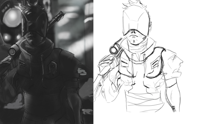
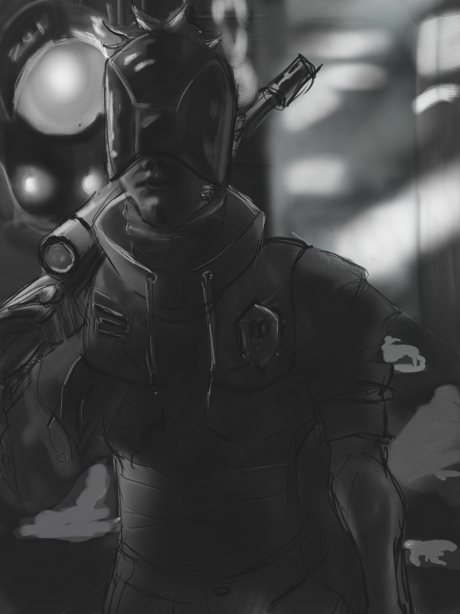
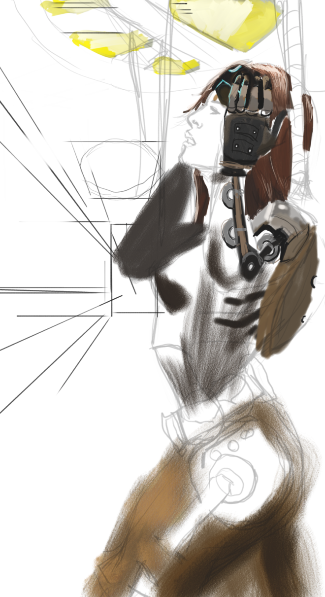
On the very basic stages on this one.  Been working on anatomy and perspective hopefully it shows a little in this.  Noticed similar to the one above but still want to work on this one. But I’ll get out of my comfort zone soon.

Back in WIPs (and some sketches)

Back and WIPs

eve walkkng_bak

This I’ve been working on for about 10 hours and don’t feel it’s quite where I want it.  I’ve been doing studies of skin and this  is the product of my learning (Still needs work but I’m having trouble figuring out lighting thing properly).  Looks like I need to work on composition, color palette, and fabric some more though.  I’ll get there eventually.

desert temple

This WIP I’ve worked on for 3 hours.  Need to fix the perspective of the temple part.  It’s partially a “photobash”.  I used a reference/mash with my father’s photo of Lees Ferry, AZ.   He will kill me when he finds out I mashed it though, “that’s not ‘real’ painting”.  He’s a Southwest Oil/Acrylic Painter/photographer  and very inspirational You can find his stuff Google + , Fineartamerica in these places.  I envy his skill with environments.

But below is the original photo that he gave me.

DSC_0635


Back and WIPs

Long past due update

So I’ve been gone a while but I picked up the tablet again recently and practiced.  material balls 2

Another material ball practice.  This one is older than the red dress fabric but gotta say I’ve been learning alot from studying different textures.  It’s also helped to figure out what brushes to use as well.red dress

This is a a quick study of a read dress using only one of my brushes so I could get the hang of it.   Plus I found out that I’m not the best with fabric so thought this would help to figure it out and it did.

Long past due update

WIP Cyberpunk

cyberpunk guy line and bwcyberpunk guy bw1

So I designed this character, at least the helmet in my sketchbook and decided to try a full painting with him.  So far still working on the values but this is what I have so far.  Playing with material balls and brushes has helped me work much faster this time which is nice.  But this is all I have so far.  I believe the lighting is off a bit but I’ll work on that.

WIP Cyberpunk

Finshed piece and a study

adrian shadowrun blend

I keep working on it but nothing seems to be working so after 20 hours of tweaking since the beginning I think I’ll move on but here’s the final file here.material balls 1

This here are some material balls or Texture balls I’ve been messing with.  I was trying mostly metallic or plastic materials and seeing the reaction to light with different settings. And also I was trying to figure out blending in different settings. The first two being painted/scraped metals, the third white plastic, fourth (far left bottom) a slightly textured plastic ball, fifth a black shiny plastic and final red plastic.


Next plan is to do more of these balls and start another piece with a mixture of character and environment. The balls were actually alot of fun but I still need to work on blending and more shiny surfaces I think still not quite getting how it works.

Finshed piece and a study

Ugh Compression/Export Problems

adrian shadowrun

So here’s the update on my Shadowrun Character WIP.  I got some help by Sr Quixote on DA [here] and was able to figure out I messed up the values so lots of tweaking.  I gotta say that this image is much less unsaturated on my tablet than on my old laptop (which I’m typing this on).  Either it was poorly compressed into a .png file vs the .riff Painter file or this old laptop screen is having trouble with the color (probably both). I’ll try to boost up the saturation in the lighting later and see if it starts to look better there.  But this image is much more grainy than the original file as well…. I’ll fiddle with the image exports and see if I can fix that too.

cyberlink 2png

This was just a test trying to figure out how to work with the limited color palette.  It’s a cyberpunk version of Link from The Legend of Zelda.   I tried to keep it colorful and it doesn’t look half bad.  I added my Black and White file to show my values that I’ve been working on my values. I actually normally have a black and white underpainting before adding color, but when I add color it seems like I’m always seem to mess up the values.  I keep rewatching Sycra’s video on value and color [here] but it seems I’m not getting it completely.  Just gotta keep trying I guess. This is also a play at having a anime style as well, been a while.

Ugh Compression/Export Problems

Interior Practice and a Character WIP

The next two paintings were tests of trying limited color palettes on an interior and character design.  Both had a black and white underpainting.  The environmental one had the usual “overlay” setting for color but I found in character design that the “Color” setting works better (and thinking about color and value helps).  Found that watching Sycra’s tutorial on color and value helped on the character painting [here] .  Still far behind on painting environments/interiors/architecture but I didn’t think the composition was terrible this time.  The rest of the text below is mainly notes to myself and showing what I want to work on next just brainstorming where to go next.sci fi chinese artrium_001

So I tried to do a very rich/limited color palette for an interior I invented using http://paletton.com/ .  Feels way too saturated though.  Note to self: Figure out color theory and using limited palettes properly.  On another note I think perhaps I should try a different type of overlay of the Black and white under painting, maybe try no under layer perhaps (?)  More testing and references needed, next time.  Texture studies for learning about marble would be a good move too.adrian shadowrun

I’ve been playing Shadowrun:Returns and Shadowrun: Dragonfall which are games on steam and this is my WIP of my Mage/Shaman from Returns that I imagined up and thought it would be fun to paint.  I used stock photos blended in for some fun, it’s not horrible but I need to figure better ways to incorporate them, I’m guessing trail and error are necessary.  Again I believe I made this way too soft with the brushes; I’ll need to play with more brushes on Corel Painter 2015.

Onward learning!


Interior Practice and a Character WIP