Ugh Compression/Export Problems

adrian shadowrun

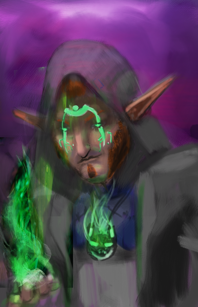
So here’s the update on my Shadowrun Character WIP.  I got some help by Sr Quixote on DA [here] and was able to figure out I messed up the values so lots of tweaking.  I gotta say that this image is much less unsaturated on my tablet than on my old laptop (which I’m typing this on).  Either it was poorly compressed into a .png file vs the .riff Painter file or this old laptop screen is having trouble with the color (probably both). I’ll try to boost up the saturation in the lighting later and see if it starts to look better there.  But this image is much more grainy than the original file as well…. I’ll fiddle with the image exports and see if I can fix that too.

cyberlink 2png

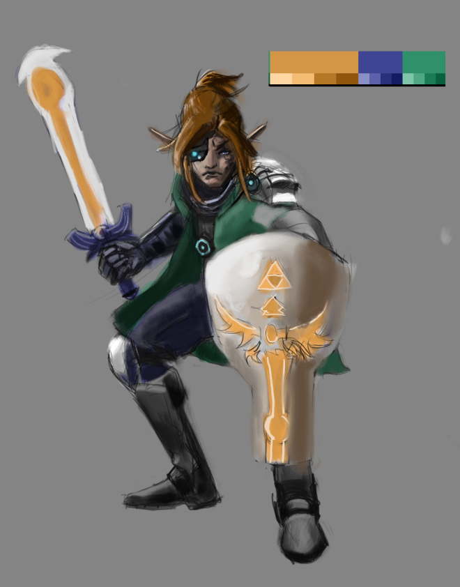
This was just a test trying to figure out how to work with the limited color palette.  It’s a cyberpunk version of Link from The Legend of Zelda.   I tried to keep it colorful and it doesn’t look half bad.  I added my Black and White file to show my values that I’ve been working on my values. I actually normally have a black and white underpainting before adding color, but when I add color it seems like I’m always seem to mess up the values.  I keep rewatching Sycra’s video on value and color [here] but it seems I’m not getting it completely.  Just gotta keep trying I guess. This is also a play at having a anime style as well, been a while.

Ugh Compression/Export Problems

Interior Practice and a Character WIP

The next two paintings were tests of trying limited color palettes on an interior and character design.  Both had a black and white underpainting.  The environmental one had the usual “overlay” setting for color but I found in character design that the “Color” setting works better (and thinking about color and value helps).  Found that watching Sycra’s tutorial on color and value helped on the character painting [here] .  Still far behind on painting environments/interiors/architecture but I didn’t think the composition was terrible this time.  The rest of the text below is mainly notes to myself and showing what I want to work on next just brainstorming where to go next.sci fi chinese artrium_001

So I tried to do a very rich/limited color palette for an interior I invented using http://paletton.com/ .  Feels way too saturated though.  Note to self: Figure out color theory and using limited palettes properly.  On another note I think perhaps I should try a different type of overlay of the Black and white under painting, maybe try no under layer perhaps (?)  More testing and references needed, next time.  Texture studies for learning about marble would be a good move too.adrian shadowrun

I’ve been playing Shadowrun:Returns and Shadowrun: Dragonfall which are games on steam and this is my WIP of my Mage/Shaman from Returns that I imagined up and thought it would be fun to paint.  I used stock photos blended in for some fun, it’s not horrible but I need to figure better ways to incorporate them, I’m guessing trail and error are necessary.  Again I believe I made this way too soft with the brushes; I’ll need to play with more brushes on Corel Painter 2015.

Onward learning!


Interior Practice and a Character WIP